Objective:
Crafted a revamped logo for a hotel restaurant, Mayrose, aimed at strengthening its brand identity and resonating with both existing patrons and newcomers. The redesigned logo delves into a deeper brand narrative, helping to reposition the restaurant more prominently among local competitors.
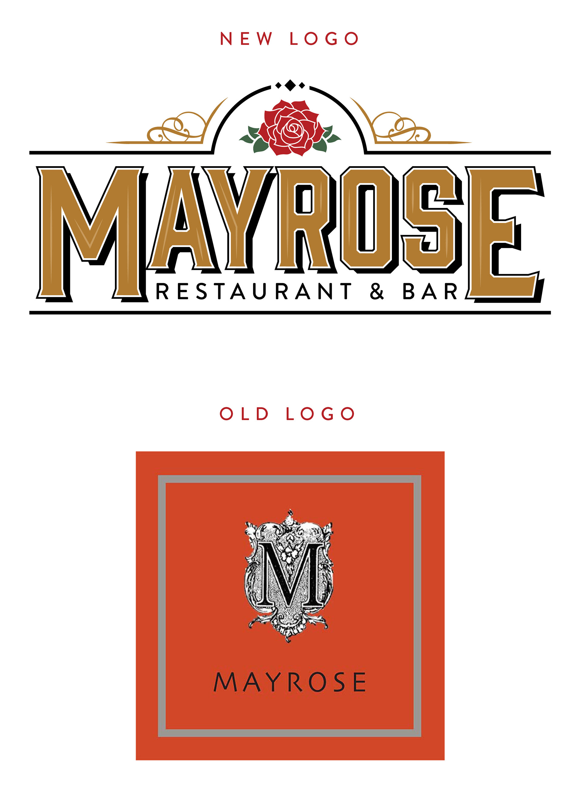
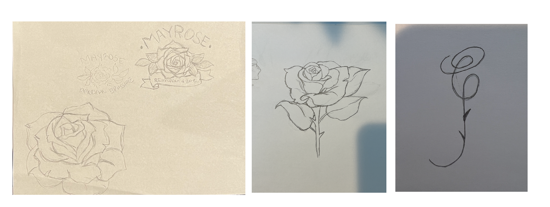
Objective: Hand-drawn sketches showcasing the restaurants icon, the rose. The rose symbolizes beauty and courage. This also mirrors the hotel's namesake, Abigail Duniway, a trailblazer who was instrumental in gaining voting rights for women in the state of Oregon.
Objective: Provide a disciplined framework around the redesigned logo by enforcing brand standards and consistency on all customer touchpoints.
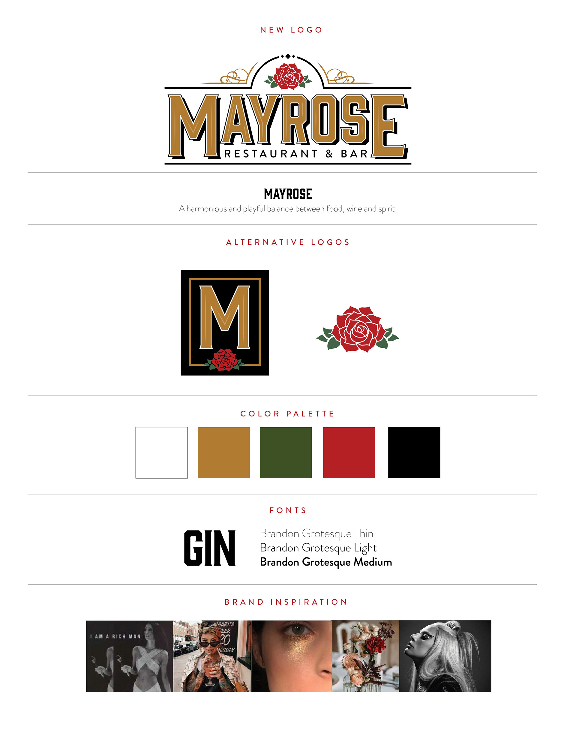
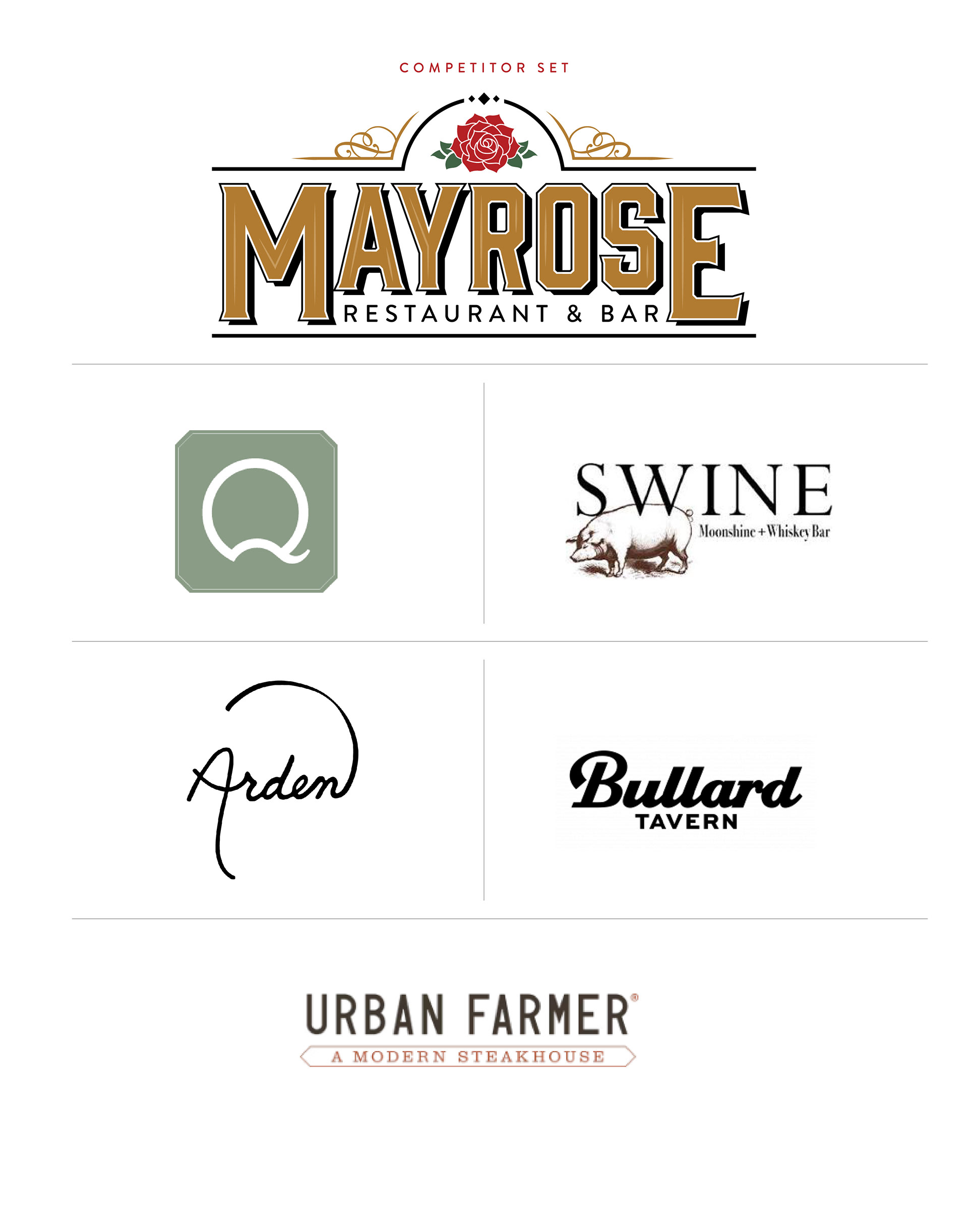
The re-designed logo was compared to a competitive set based on similar cuisine within a 1-mile radius of Downtown Portland. Most patrons either already work in downtown Portland, are suburbanites who venture out to the city on the weekends, or guests at The Duniway Hotel.